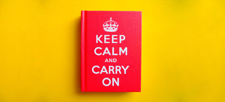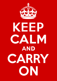

I find it interesting that the overall design of the Keep Calm and Carry On poster, aside for the absence of the color blue, appears very similar to the color and typography used in the campaign materials used by the Obama campaign in 2008 (Wikipedia, 2011).

I wonder if there is something inherent in the character/personality of the Gotham typeface that somehow is associated with hope and moving forward. As these two separate designs, to me, feel as if they cover a similar communication/territory for purpose and feel.
This past week, I saw the Keep Calm and Carry On poster again. Though, this time it was on the cover of a cute little book belonging to one of my associates at Michigan State University. The book (which was published by Ebury Press in 2009) contains short, inspirational quotes set in the same Gotham typeface that was used in the poster design. I may have to consider picking up a copy for myself in the near future.
Keep Calm and Carry On may be ordered from Amazon.com.
References
Wikipedia. (2011). Keep Calm and Carry On. Retrieved on August 7, 2011 from http://en.wikipedia.org/wiki/Keep_Calm_and_Carry_On.
Wikipedia. (2011). Barak Obama presidential campaign, 2008. Retrieved on August 7, 2011 from http://en.wikipedia.org/wiki/Barack_Obama_presidential_campaign,_2008.

Wow! Hadn’t thought of that connection. Who will dare to use Gotham now? Those are very big expectations/promises.